Letterform Exploration
Program » Adobe Illustrator
Format » Six 7in x 7in
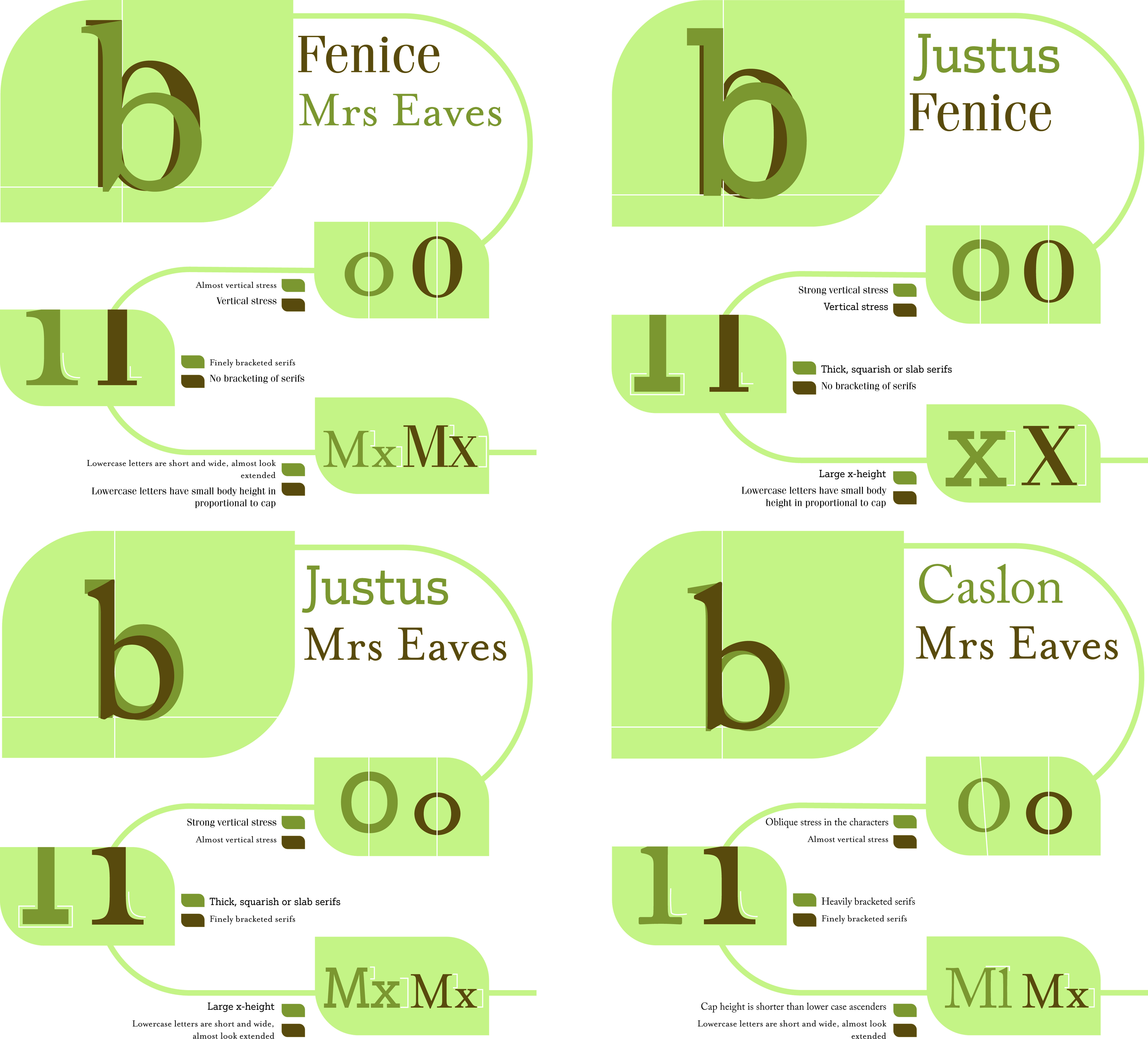
Our goal was to explore the subtleties of letterforms and create a work that clearly demonstrates their differences for this project. Using straightforward but effective techniques, I tried to highlight the differences between different letterforms. My strategy was to keep things simple and effective, whether it was using lines to indicate the difference between sans serifs and serifs or the same lines to convey tension and different x-heights. Furthermore, I selected a subdued color scheme with the intention of creating a soft visual appeal that would make the spectator feel at ease and comfortable.
BACK