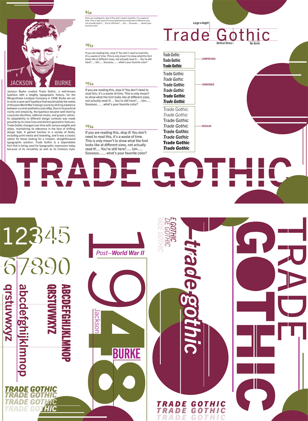
Trade Gothic
Program » Adobe inDesign
Format » 17in x 11in
For this project, we were charged with investigating both the aesthetics of a certain font design and the dimensions of typographic experimentation. Using my understanding of hierarchy from other work, I felt that this piece truly stretched the possibilities of typography. I decided to base my design on the Trade Gothic typeface and created a rollover folded booklet that described the font and its many family members. I chose maroon, magenta, and olive green because I wanted to employ a strong, rich color scheme.
BACK